All Posts By

Stacey

Live

Photography Course London

While we were in Hong Kong at Christmas, it occurred to me that we never take a camera on holiday anymore. Or anywhere. Obviously we’ve got cameras on our phones and obviously I am always snapping all sorts of nonsense to stick on Instagram, but the (quite expensive at the time) DSLR camera we have at home sits in its bag, never leaving the house. There were so many amazing sights on that holiday which could only really be captured with justice by a decent camera with actual settings, that it made me realise that even if I had brought the camera with me, I don’t actually know how to use it.

A shout out on Twitter and a few course providers were quickly recommended. I liked the sound of the Photography Course London’s ‘Intense Foundation of Digital Photography – Level 1’. It looked comprehensive and even better, it was a Saturday course. With all the best intentions, I know that it is impossible to do anything intense after a day’s work, so a Saturday suited me perfectly. I booked up. The course is aimed at ‘complete beginners who own a Digital SLR camera and want to maximise its potential’, so it sounded perfect. I didn’t want anything with post-production as I can learn that from Madge (or make him do it for me…!!)

We had to bring an image along for discussion, so I set off bright and early up to Shoreditch with my camera, my 2 images (I couldn’t choose) and a notepad. The course is set in a small classroom environment, with everyone around a long table. I think there were 11 people; it’s nice that the classes are kept small, because it means that there is time for questions and it doesn’t feel too rushed.

Once we had all talked through our images we got on with the learning. The course itself is very much focused on how the camera works – the basics of getting the camera off the ‘auto’ settings and starting to understand how you can change things to get the best picture. There was a lot to take in and at some points it felt quite overwhelming. I felt a definite dip after lunch and by the time we got to fully manual settings at the end I was a bit at maximum information overload. But there were lots of very helpful and practical set up routines and tips. It was great to learn how to take depth of field pictures, as these are a particular favourite of mine.

There is not that much actual taking of pictures on this course, the focus is definitely on the theory and mechanics, though we did get out a couple of times for some shots in the courtyard.
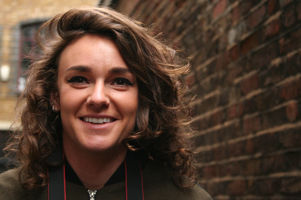
It was a very cold and rainy day, so it was quite hard to enjoy the outside bits and we weren’t able to be out too long really. By the later point of the afternoon we were losing the light. We also took shots in the classroom, of eachother and of props – trying out the different settings and techniques we were being taught.
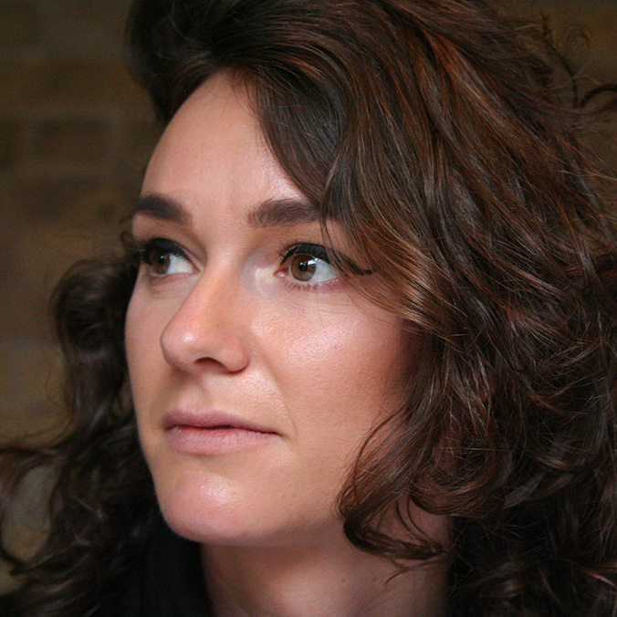
I really enjoyed the day. It was quite tiring and it is very intense. I’m glad I took lots of notes but I think I’d also like to buy a good book, to read and practice with in my own time. I’d definitely recommend the course, although if you are looking for a creative photography lesson this is not it. I might look at a follow up session in a few months, once I’ve got some practice under my belt. With a short trip coming up, I should get plenty of chance for that. This time, the camera is definitely coming 🙂

For those interested, the course covered:

  • Buttons and functions
  • Menus and settings
  • Aperture
  • Shutter-speed
  • ISO
  • Exposure
  • Introduction to White Balance
  • Auto Focus and Focus Points
  • Manual Focus
  • Exposure compensation and exposure lock
  • Basics of RAW
  • The light meter
  • Metering modes
  • Aperture and shutter speed priority
  • Manual mode
  • Depth of Field
  • Freezing and blurring motion
  • Basics of composition
  • Optimising the camera settings

All pictures here are all as they were taken – no colour correction or post production, all I’ve done is resize them for the internet.
 

Save

Save

Save

Save

Save

Play

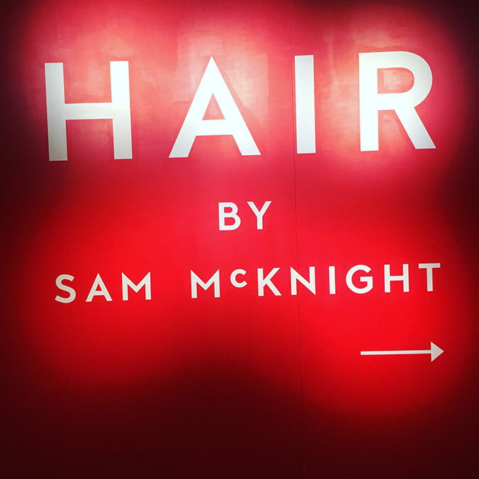
Hair by Sam Mcknight

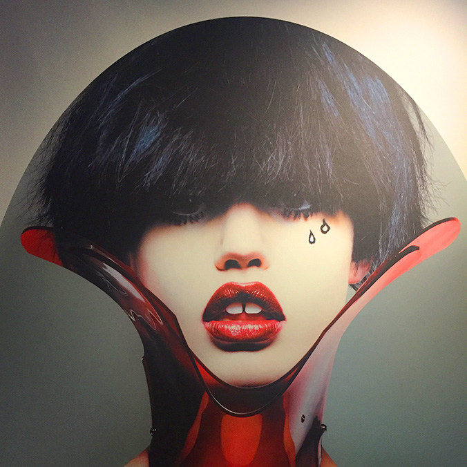
I wasn’t quite sure what to expect from an exhibition about hair, but I thought it might be fun to go and find out before it closed on 12 March, so I went along to Somerset House a couple of Thrusdays ago to see the Sam McKnight show.

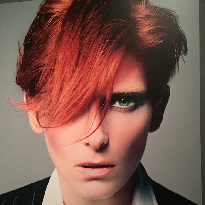
It’s a major retrospective celebrating a 40-year career of one of fashion’s top image makers, and the first to showcase the role of the hairstylist on the catwalk and in creating iconic editoiral shoots. McKnight has worked on more Vogue covers than anyone else, styling supermodels and working with international fashion designers such as Chanel and Vivienne Westwood.

When we went it was very quiet, we were the only 2 people in the gallery and it felt like we had the place to ourselves. There are some amazing shots – Tilda Swinton, Kate Moss, Diana and all of the supermodels – and to be honest I got lost in the photographs, almost forgetting about the hair.

One thing that did amaze me though, were the shots of the models being styled backstage at the catwalk shows. It looks almost brutal – I don’t know how they put up with being pulled about by so many people!

It was a nice way to while away 45 minutes or so, and at £13 a ticket it wasn’t over-priced. And by the time we got to the bar at One Aldwych, we really felt like we deserved those cocktails!

Design

Design hero: Frank Pick

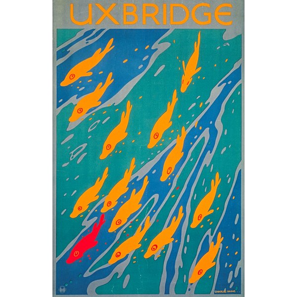
On my recent visit to the London Transport Museum, I was fascinated to see the design system and assets in one place, but also reminded how brilliant some of the graphic design – in particular the posters – has been over the years.

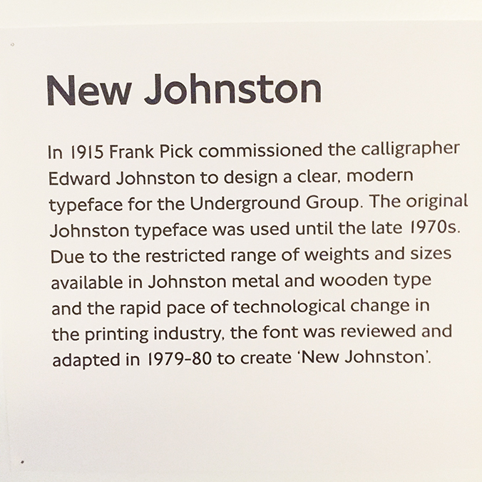
According to the Museum website, the modern graphic poster came into use in the 1890 and when Frank Pick was given responsibility for London Underground’s publicity in 1908, he recognised the potential of this powerful medium. Pick commissioned established artists such as John Hassall to design posters, and of course he went on to commission Edward Johnston to create the iconic typeface.

2002-399

Pick’s vision was that rather than focussing on the tube journey or transport, that people could be enticed to use the Underground by the attraction of the destination. This approach was soon adopted by bus and tram companies, featuring pictures of countryside scenes to encourage people to leave London for visits. Pick had a ‘passionate commitment to good design and an enlightened approach to the commercial application of art’, according to the London Transport Museum, and he commissioned artists and illustrators to fulfil his vision. Many younger and lesser-known artists went on to become famous.

5968_7

It is amazing that Pick trained and qualified as a solicitor, and as far as I can tell didn’t have any formal design qualifications. Yet his influence in steering the London Underground corporate identity, his vision in commissioning artists, illustrators and graphic designers and the establishment of an iconic brand language – the typography, the roundel and the visual style is still evident in London today, over 100 years since he first took on responsibility for the marketing of London’s Underground. Pick’s influence does not only extend over the graphic but also the architectural history of London.

“The test of the goodness of a thing is its fitness for use. If it fails on this first test, no amount of ornamentation or finish will make it any better; it will only make it more expensive, more foolish.” Frank Pick.


Save

Save

Save

Save

Design

Tattoo: First session of 2017

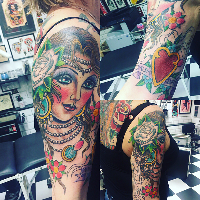
That red heart. Yeah, that hurt. But the girl head is fully finished and it’s only the painful fleshy bits to go! I’m really pleased with how this is coming along, only a few more months to go!

IMG_8596

Save

Save

Save

Design

Designology late debate, London Transport Museum

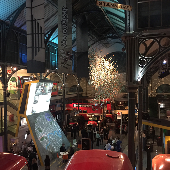
‘Designology’ at the London Transport Museum is a year-long programme of events, focussed around design and London’s transport – exploring how design makes London better. Subject matters include wayfinding, mapping, data, social behaviour, service design, street furniture design as well as branding and principles of one of the leading design systems in the world.

It’s been ages since I visited the London Transport Museum, so I was really pleased to go again, and booked specifically for the Late Debate, which also gets you entry to the Designology studios.

IMG_8560

Until you see all of the design system and principles together, you don’t fully realise how the persuasive identity of London’s transport system is actually, in large part, the visual identity and language of London.

All Londoners and visitors know the iconic typeface and brand assets, but seeing it there together, on signage, bus stops, and literature – in it’s earliest form and in modern digital – you get a true sense of how well this important London artefact has been cared for and protected, and how it is still as vital and relevent today as it ever was.

IMG_8551

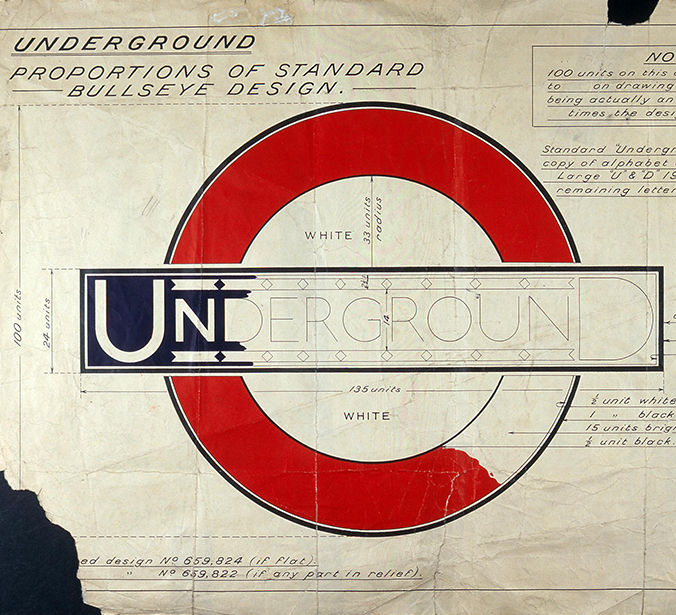
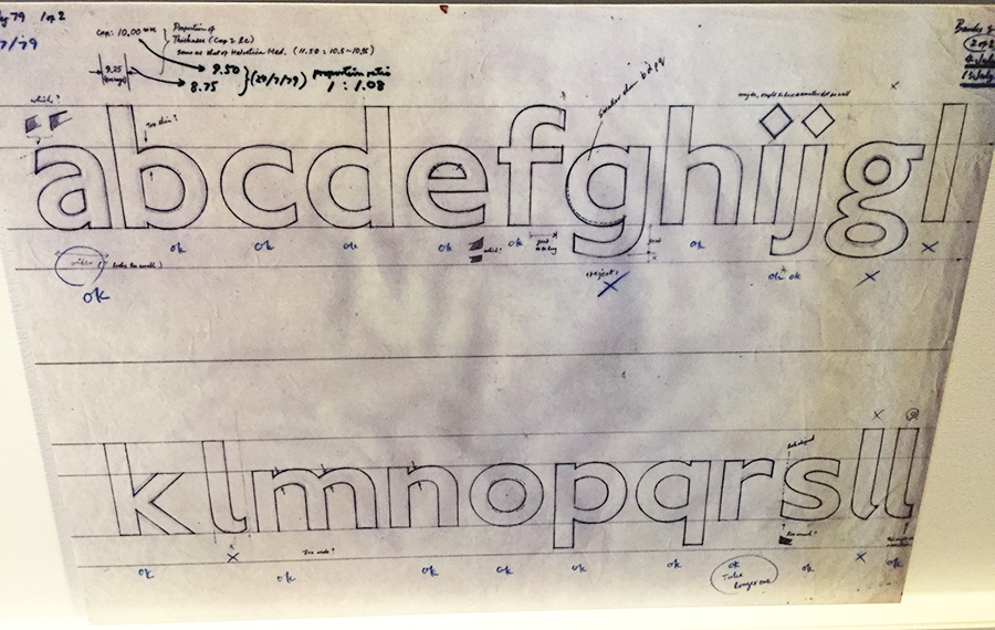
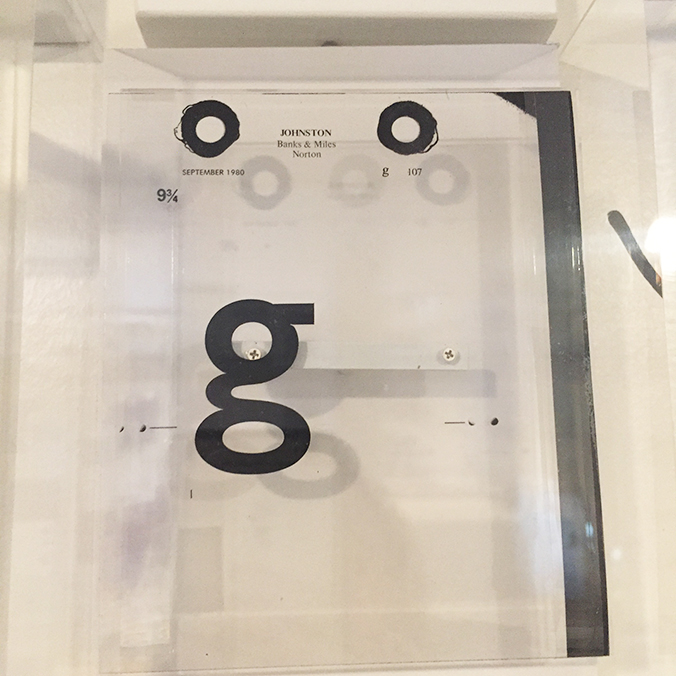
It was fascinating to see original handrawn/marked up fonts.

IMG_8565And seeing individual pieces of film brought back memories from my print design and production days.

IMG_8554

I don’t know if there is any urban design language that is as influential as the London one, or as recognisable. What struck me was also not just the very recognisable brand assets, but also the wealth of graphic design generated by or for London Underground/Transport for London over the years. That’s a whole separate post!

But to the debates. So, the talks started at 8pm for an hour, and there were 4 to choose from:

Off the rails: Expert historians, authors and contemporary designers explore designing for the railways, sharing from the past and debating recommendations for the future.
Secrets behind the Tube map: Tube obsessed Londonist Video Journalist Geoff Marshall to explores the history, anomalies and oddities of our much loved London Underground Map.
Delight and surprise: Explore how our journeys can be impacted through moments of delight and surprise, and how such moments make London a world class leader in design.
Connect or forget: New London Architecture and a panel of expert speakers consider how the Tube and wider transport network has the ability to connect or forget regions and communities.

We chose the ‘Delight and surprise’ stream and heard interesting presentations from the team who curate the Art on the Underground programme, a new innovative scheme to use plants and bio installations in tube stations, how advertising has changed over the years and about how events are an important element in community programmes. The presenters were very interesting, especially the Art on the Underground one, but it never really felt like a properly curated debate. There wasn’t really enough in the subject matter to debate and with an hour to cover 4 topics it didn’t feel like any went into enough depth to get a robust discussion going.

That said, I really enjoyed the evening. I got to spend time with my friend Paul, immerse myself in lovely design things and drink wine in a superb venue. What’s not to like 🙂


Save

Save

Save

Save

Save

Save

Save

Save

Save

Design

Maison et Objet, Paris – part deux

There was so much to see at the show that it was almost impossible to cover in one day, let alone one blog post. So this second post focuses more on furniture and objects.

There were distinct themes and trends coming through. My favourite was the natural, scandi-influenced furntiure and styling, using natural palettes, fabrics and textures.

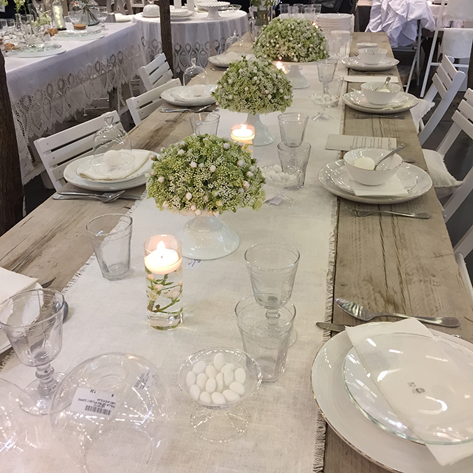
This table was a stand-out piece for me. It reminded me of long-lazy summer lunches and made me wish for a mediterranean terrace to set like this. The picture probably doesn’t do it justice, but it really was wonderful. I could imagine an outdoor wedding or birthday party full of friends and family around this table.

IMG_8509

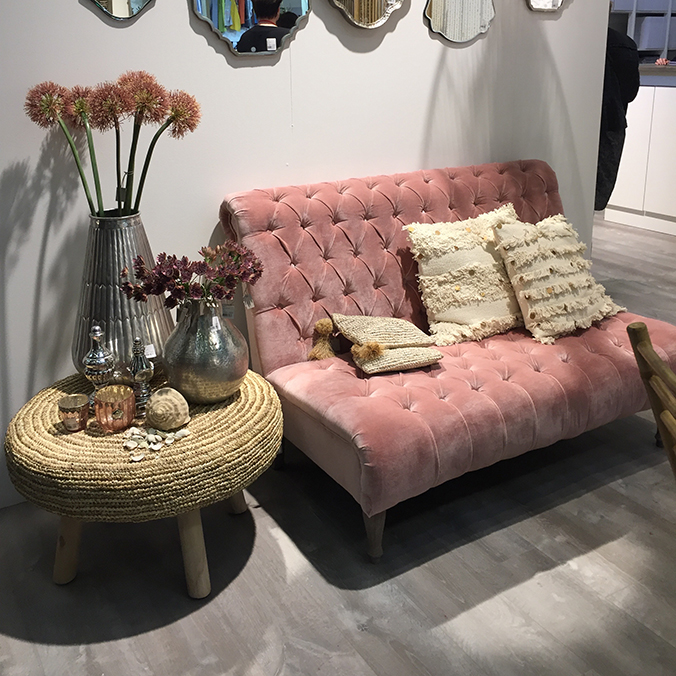
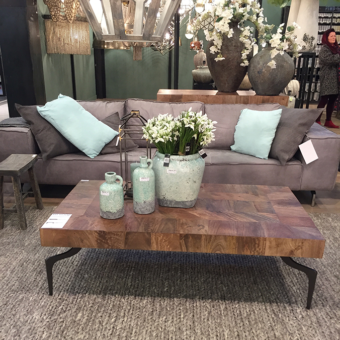
There were lots of dusky pinks and slate colours, and light blues as accents.

IMG_8514

IMG_8520

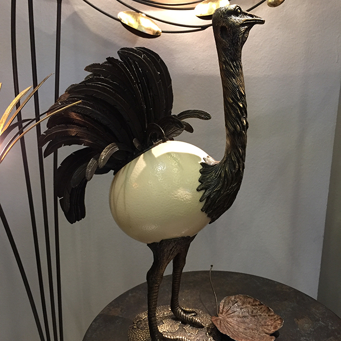
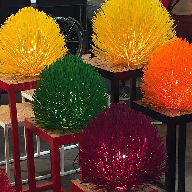
There was also some quirky stuff, which, in small doses in the right place could look quite cool. This bird and the weird wooden lamps were fun.

bird

IMG_8500

This is literally a drop in the ocean on the items on display and the beautiful roomsets to view. You could easily spend a couple of days taking in the vastness of the show and spending time talking to the designers, but all too soon our whirlwind tour was over! I think we covered about 5 miles in the exhibition centre alone, so if you do go next year, wear comfy shoes!

Save

Design

Maison et Objet, Paris – part une

I was invited to attend Maison et Object with a friend who is an interior designer. I had never heard of the show before as the worlds of digital and interior design don’t really cross that often, but I was excited to find out what it was all about and learn a bit more about interior design.

An early start from home to London then a hop on the train across (well, underneath) the channel and we were soon in Paris. The Maison et Objet international trade fair is held in a huge, multi-hall complex out near the airport. There were (I think) 8 halls in total, covering sectors such as ‘Eclectic’, ‘Cosy’, ‘Elegant’ and many others, right through to ‘Fashion’ and ‘Beloved’, and many more. Quite a daunting prospect to cover that much ground in one day, but that’s all we had, so we dived straight in – starting at the very first row.

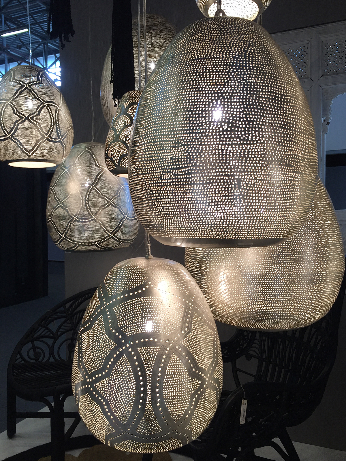
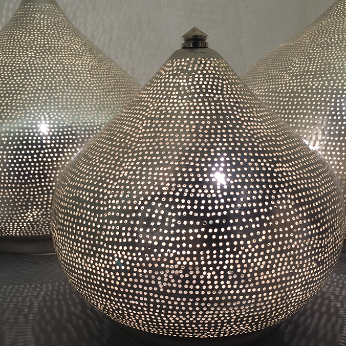
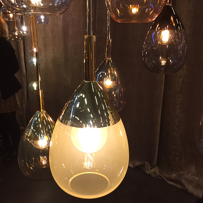
Immediately I saw much that caught my eye. These beautiful metal lamps and lightshades looked wonderful together, throwing out warm and homely light. They are from a company called Zenza, based in the Netherlands, and I wanted them all!

IMG_8487

IMG_8488

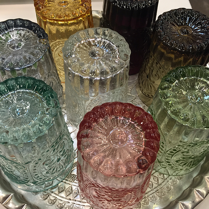
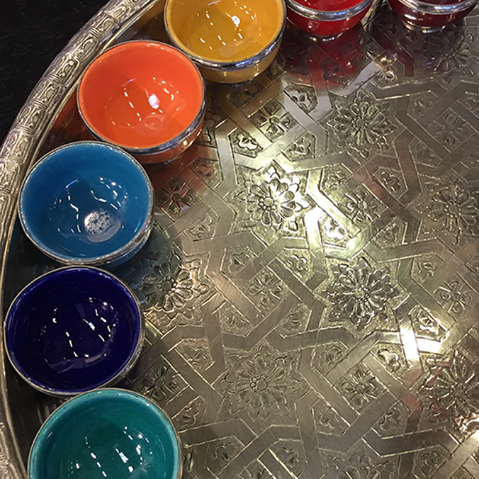
There were some real standout themes for me; silver coloured metals, drop lighting and coloured glass, along with North African inspired colours, set against natural palettes and fabrics really worked.

light

IMG_8490

IMG_8495

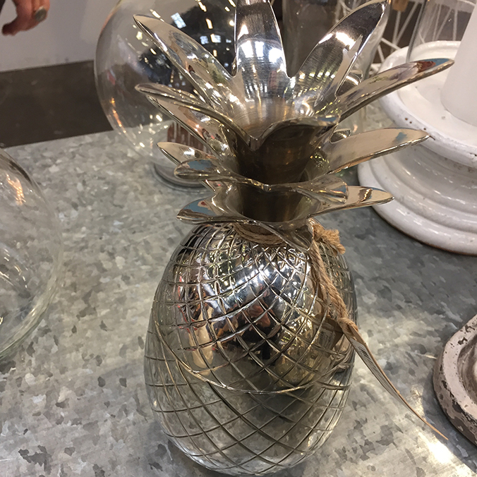
Talking of metals, there were pinapples everywhere – though not many in silver, like this one.

IMG_8508

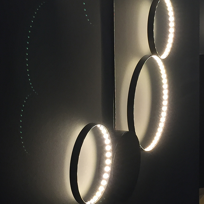
There was lots of lighting at the show, and these ones from Le Deun really stood out for me. I’d love to use these somewhere – I assume you can place them on walls or ceilings. They looked stunning together on the stand, and they are designed and manufactured with low energy consumption in mind.

IMG_8535


Save

Save

Save

Save

Save

Travel

Poland

Not long back from Hong Kong and I had to fly to Poland, for work.

I’ve wanted to go to Poland for a long time, not least because my Nan was born there and there are probably some Polish family somewhere. But this was a work trip, so all no time to sightsee.

The sky as as we flew into Warsaw was stunning. This shot is so dreamy!

IMG_8411

There was time for some nice vodka on the second evening, when we were taken for dinner. I bought a bottle of this to bring back too, it’s lovely.

IMG_8436

Needless to say, there was snow everywhere. We were lucky, it had warmed up to only -10. A few days before it had been as low as -25.

IMG_8444

Save

Design

British Airways typography

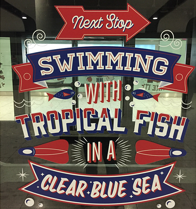
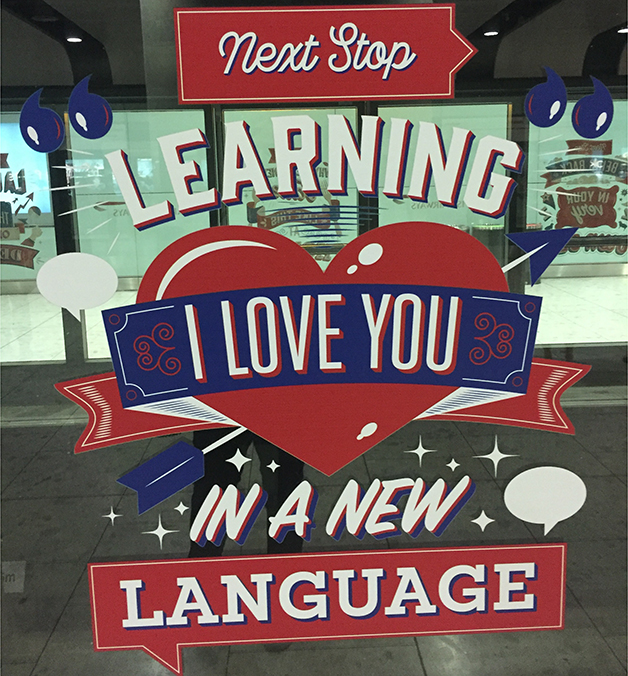
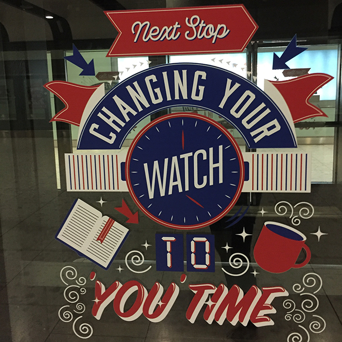
Loved these messages on the little shuttle train at Terminal 5.

IMG_8101

I really like this type style, with illustrations and a mix of fonts or handrawn elements.

IMG_8103

And using just a 3-colour palette really means they stand out, without looking too busy.

IMG_8102

Save