Browsing Category

Design

Design, Work

Big stories, big dreams

Every brand has a story, and ours started in Summer 2024. Madge and I have a passion for great design, creativity, and living a balanced life. After spending our entire careers in the creative and digital industries, we decided to take some time out and embark on a new adventure – creating a brand that reflects our personalities and the life we love. And so, Big Stories was born.

Graphic showing the peaks of the Penine Way

From the very beginning, we’ve been inspired by those laid-back souls who love a good sunrise, a sunset beer, time at the beach or a weekend hike. Big Stories is for people who cherish a spontaneous road trip as much as meticulously planned moments and our t-shirts are designed to be the perfect companion for all of your adventures – made for comfort, style, and sharing a bit of who you are with the world.

Sustainability is more than just a buzzword

In the fashion economy today, resources are extracted and turned into products that are designed to be thrown away. As a result of this linear economy, a dump truck per second of textile waste ends up in landfill or incinerators. This is unsustainable. And it’s why our products are made from natural biodegradable materials including post-consumer recycled organic cotton. And when items wear out, you can send them back to us. All Big Stories products are designed to be remade. These products are printed on demand and sent back again, ensuring materials stay in the loop.

It was really important to us that we could do this in a sustainable way. We’re committed to creating clothing that you can feel good about wearing – not just because it looks great, but because it’s made in a way that’s respectful to the environment and kind to the planet.

It’s all part of our mission to make sure that when you wear a Big Stories tee, you’re not just making a style statement – you’re making a positive impact on the planet, too.

“We believe what we wear tells our stories. Our t-shirts are a canvas for the bold, the unique, and the unforgettable moments of life. Celebrating balance, we create sustainable clothing that connects with the mind, body, and soul. Our designs are inspired by the passions that fuel us.”

Designing for the moments that matter

Design is our passion, and it shows in every t-shirt we create. Inspired by life’s pleasures and unforgettable moments, each design is handcrafted. We believe in the power of great design to inspire, uplift, and tell your story, and our designs are inspired by the things that fuel us. We want our tees to feel like they belong with you, whether you’re out hiking, chilling at the beach, or kicking back with a good book.

We want you to take our t-shirts on every adventure, to wear them again and again. So that’s the story behind Big Stories.
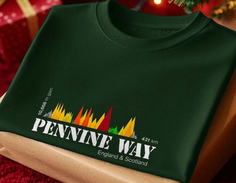
T-shirt showing graphic image of Pennine Way climb
Design, Travel

SFMOMA

A flying visit to San Francisco on my way to Monterey on business – and SFMOMA was top of my list of places to visit. It didn’t disappoint.

I took myself off on Saturday morning, while it was still relatively quiet – and on the advice of a friend, covered the whole gallery from top to bottom. It’s almost impossible to pull out everything I loved, but here are some highlights.

Jenny Holzer, 1983: Truisms

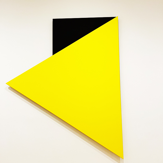
Artwork showing yellow triangle and black block

Ellsworth Kelly, 1993: Yellow Relief with Black

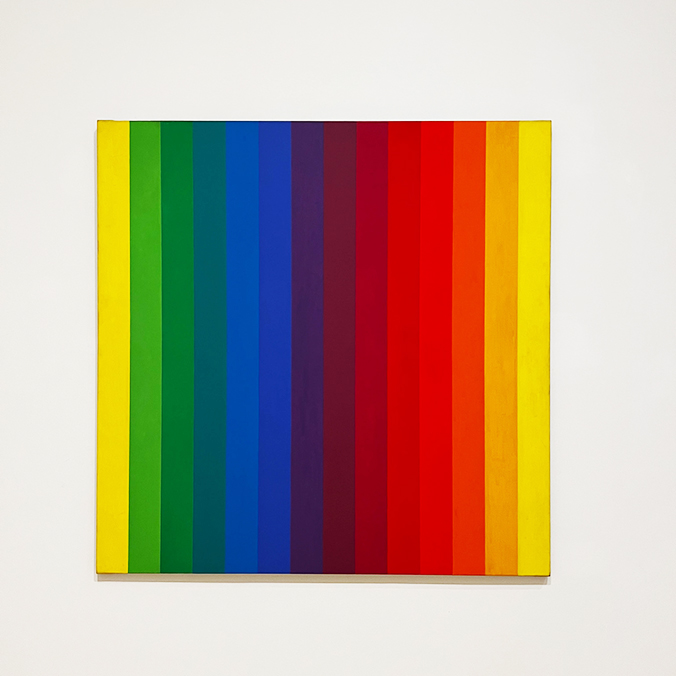
Image of a colour spectrum

Ellsworth Kelly, 1953: Spectrum 1

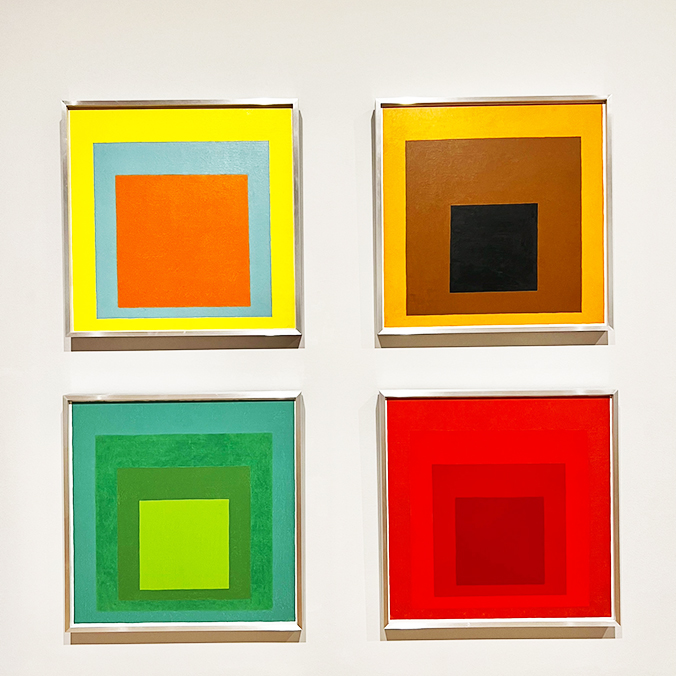
Artwork of four squares with squares nested inside

Josef Albers, 1954: Homage to the Square

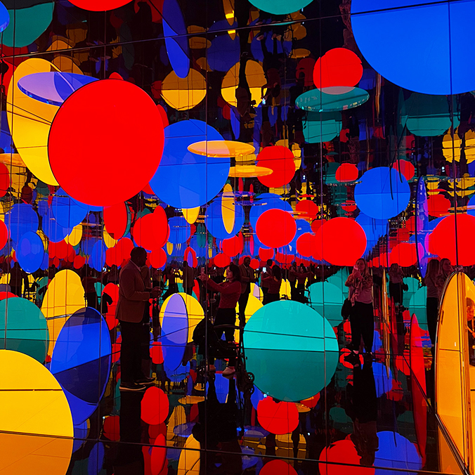
Immersive experience

Yayoi Kusama: Infinite Love

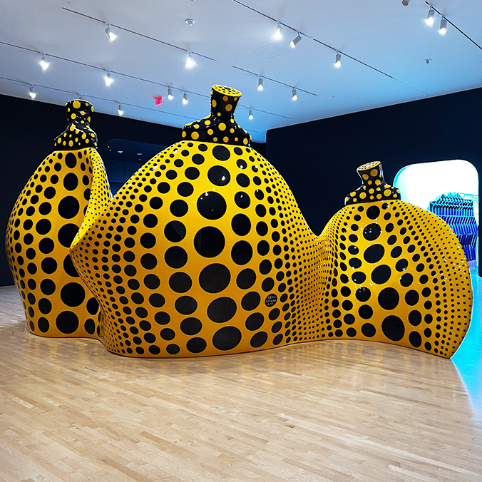
Installation of yellow and black abstract pumpkins

Yayoi Kusama: Aspiring to Pumpkin’s Love, the Love in My Heart

For Yayoi Kusama, pumpkins have been a lifelong source of fascination. She was first drawn to them in childhood, citing their “generous unpretentiousness” and “spiritual balance,” and has explored them continually in her painting, sculpture, installation art, and poetry.

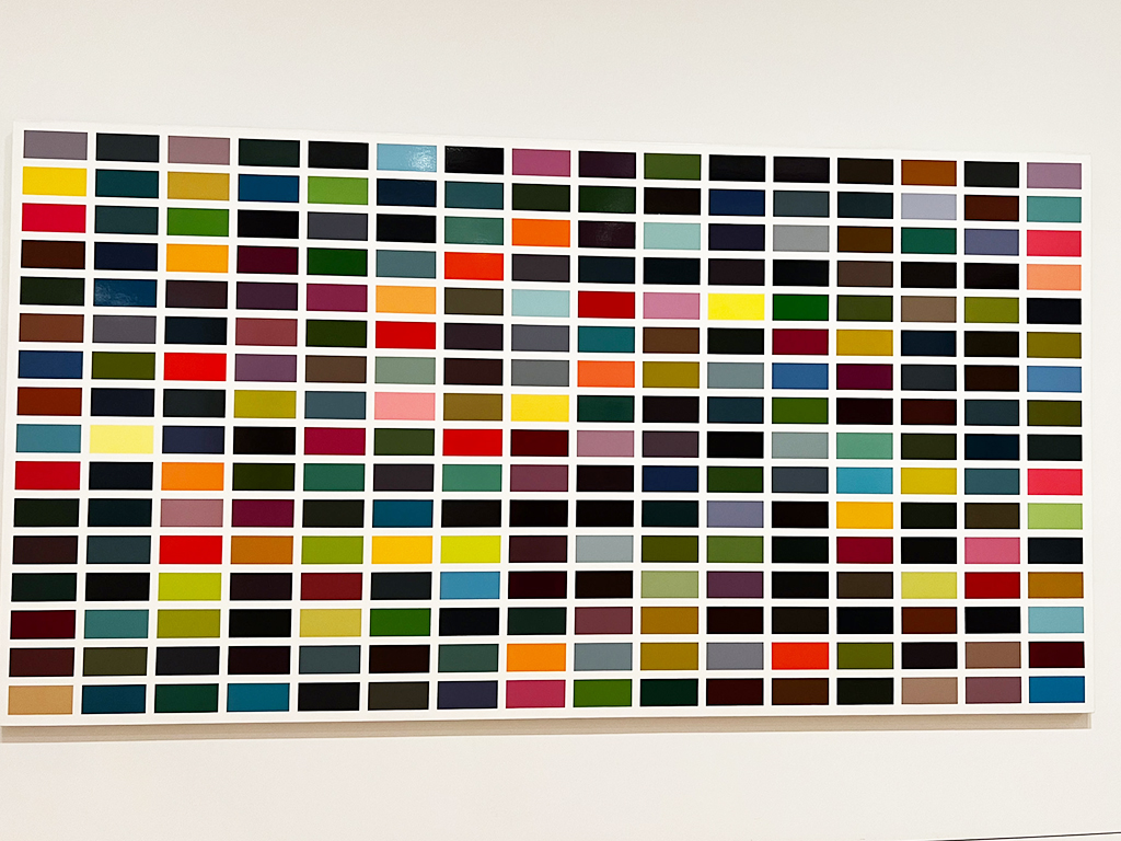
Artwork called 256 Colours by Gerhard Richter

Gerhard Richter, 1974: 256 Farben.

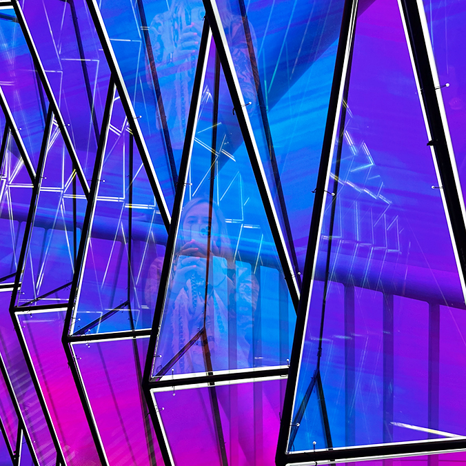
Blue and purple immersive tunnel

And lastly, this amazing immersive glass tunnel…I didn’t note the artist, but I loved it!

There were so many, many more pieces I loved. This is just a selection of the great work on display.

Design

Eastbourne hosts the Turner Prize

When I heard the Turner Prize was being exhibited and hosted in Sussex, it definitely made it onto my ‘must-see’ list for this Autumn.

The Turner Prize is probably the world’s best known art event, and is awarded to a British contemporary artist for either an outstanding exhibit or other presentation of work in the past 12 months. Previous winners include Grayson Perry, Rachel Whiteread, Anish Kapoor and Damien Hurst.

So on a wet and windy Thursday, we set off for Eastbourne to visit the exhibit at the Towner Gallery. I wasn’t really sure what to expect…

There are 4 shortlisted artists – and the award ceremony is being held on 5 December. The whole exhibition was free to enter, and it was great to see the amount of accessible and inclusive tools and resources available to ensure the widest audience possible could enjoy the art.


The first set of exhibits were by Ghislaine Leung, who focuses on the conditions of art production, its presentation and circulation. As I understood it, Leung creates text-based instructions/descriptions that are then executed by the gallery team. And so this execution obviously changes with every team that realises it. It’s interesting conceptually, and I quite like the idea that the piece changes with every interpretation and every context, but, I guess, at a basic level, some pipes and a water fountain just wasn’t that understandable – and even less so if you hadn’t read the descriptions or watched the video.

Rory Pilgrim uses song writing, film, texts, drawings, paintings and live performance in his work – challenging the nature of how we come together, speak, listen and achieve social change. His film, RAFTS was made during the pandemic – a raft keeping us afloat in challenging or dangerous times.

We didn’t get to see the whole film, as there were specific screening times, so we only ducked into about 10 mins worth, unfortunately. The film is narrated by residents of Barking and Dagenham from Green Shoes Arts and includes singers and members of Barking and Dagenham Youth Dance. It really felt like this had been made in and with the community and took contributions from a wide and diverse set of people. While it was definitely interesting and I would love to have seen more, it felt like something I might watch on TV, rather than a piece of award-winning art. But what do I know, I’ll probably be totally surprised by the time the entries are judged.

The absolute stand out of the show for me, was the exhibit by Barbara Walker. And not just this show – it’s one of the best exhibitions I’ve seen. I’m still thinking about it now.

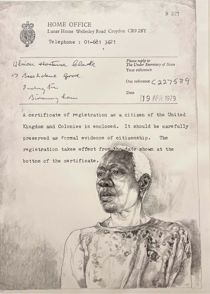
In Burden of Proof, Walker directs our focus towards the individuals, families and communities whose lives have been touched by the Windrush scandal. The work shows really impactful large-scale charcoal figures intricately sketched directly onto the gallery wall, accompanied by a compelling series of surrounding images. Through monochrome portraits, Walker layers poignant images of those affected by the scandal over meticulously hand-drawn reproductions of documents that underscore their right to remain in the UK.

This thought-provoking display really encouraged me to contemplate on the genuine repercussions of these political decisions. This work stands as a powerful exploration of the human stories that sit behind (and are directly impacted by) bureaucratic cruelty – and you get a real sense that the people were forgotten as the documentation became the important thing.

The wall drawings will be washed away at the end of the exhibition, to signify erasure and disappearance.

And lastly, I was excited for Jesse Darling’s entry, which promised ‘an installation that explores borders, bodies, nationhood and exclusion’. Unfortunately I didn’t like it. I guess crash barriers, barbed wire and net curtains do that – but it all felt a bit clichéd to me. There didn’t seem to be any fresh or new thinking around that theme…but hey, that’s just to my untrained eyes.

So, while two were a definite ‘no’ for me, if you go along just to see Barbara Walker’s Burden of Proof it won’t be a wasted visit. And there’s a public art trail and other events in the town worth sticking around for.

Turner Prize – 28 September 2023 to 14 April 2024 (free admission).

Design

REBEL at the Design Museum

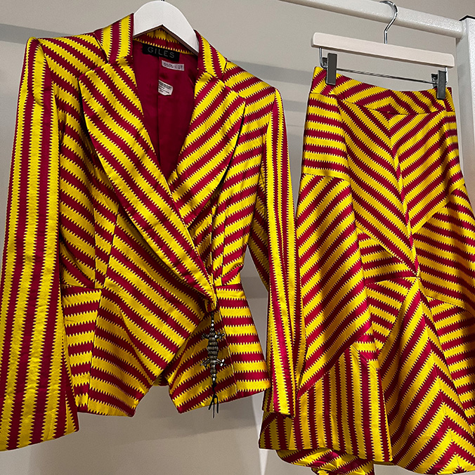
Went to see this fashion exhibition at The Design Museum, which is in collaboration with the British Fashion Council (BFC) and celebrates the 30th anniversary of the BFC’s NEWGEN programme. The show, sponsored by Alexander McQueen, focuses on the work in the early careers of design talent that has been supported by the programme.

Loved this Giles Deacon suit.

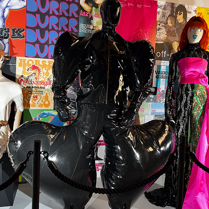
Highlights include the swan dress controversially worn by Björk at the 2001 Oscars, Harry Styles’ Steven Stokey Daley outfit from his video for ‘Golden’, and Sam Smith’s inflatable latex suit by HARRI from this year’s BRIT Awards. Collections and work by JW Anderson, Wales Bonner, Erdem, Molly Goddard, Christopher Kane, Simone Rocha, Russell Sage, and many more.


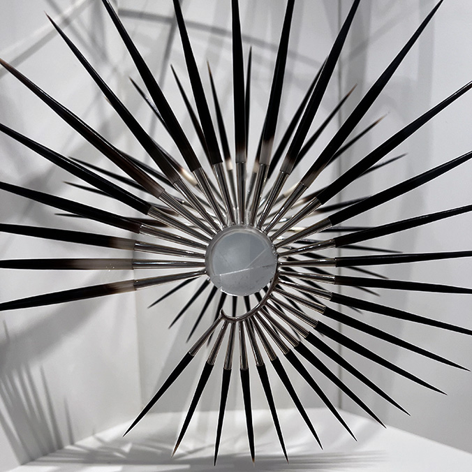
And this ear cuff was extraordinary.

The show is great, and is on until 11 February 2024. Go see.

Design

Mary Quant at the V&A

The hot fashion ticket in London this year is the Dior exhibition at the V&A, but I when I was looking for somewhere for a Birthday treat for my Mum, the quieter and smaller Mary Quant retrospective stood out to me as the one to book.

I didn’t know much about Mary Quant – and I was really pleasantly surprised how much more to her story there was than just the famous Sixties miniskirt. In fact, the show content is broader than just that period – covering from about 1955 to 1975 – and featuring fashion, make-up – and my personal favourite, the Daisy dolls.

Quant moved into the toy market in 1973 with Daisy, the ‘best-dressed doll in the world’. This enabled the next generation to connect with her brand, buying miniature versions of the designs for the jet-setting, independent doll. The launch at the Harrogate Toy Fair featured models dancing down the catwalk wearing life-size versions of Daisy’s wardrobe.

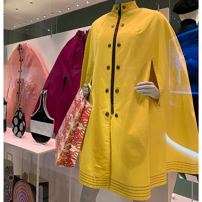
I loved these brightly coloured swinging rain capes – which came in yellow, pale pink, hot pink and orange. I’d wear one of these now.

Quant designed a range of these bold rain capes for Alligator Rainwear in a rainbow of the season’s ‘snappiest shades’. The paired-back and fun design in showerproof cotton canvas features slash pockets, a central zip front, metal studs and Quant’s signature colour contrast top stitching at the hem. The advertising proclaimed ‘Quant girls take shelter under this swinging cape’.

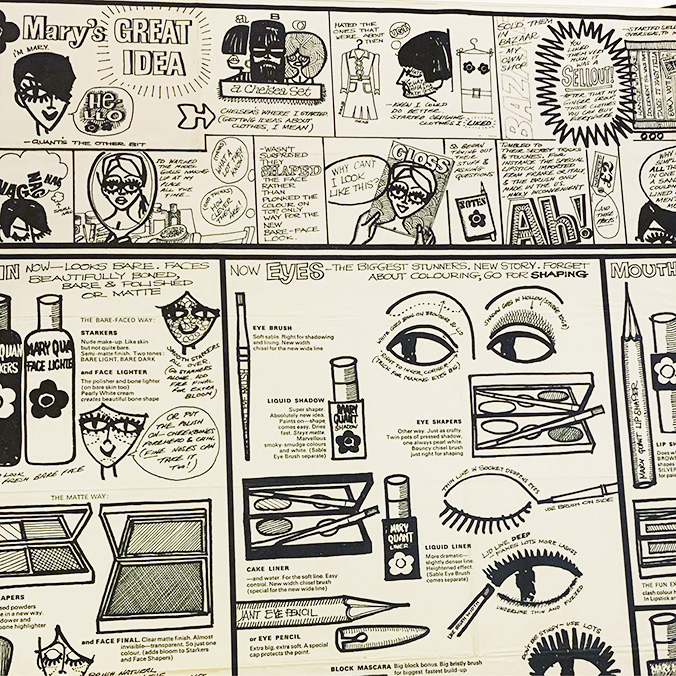
And getting a glimpse behind the scenes at the creative process was great – this storyboard featuring Quant’s make up products is ace.

At the heart of this collection though, are the stories of the women who wore Quant’s clothes – which were fun, accessible and gender-boundary pushing – at a time when women couldn’t even wear trousers into a restaurant. A lot of the pieces were sourced from the public, via a call-out from the V&A last year and there’s a charming video display of personal photographs and snippets about the pieces, from people that bought them, or their families.

The exhibition runs until February next year – so there’s plenty of time to go and see it. I’d highly recommend you do 🙂

Design

McQueen

A bit late on this one, but I couldn’t let it pass. Of course I was going to go and see the film and I expected to be dazzled to see the seminal catwalk shows on the big screen. What I didn’t expect was just how brilliant, immersive and emotional the whole (almost) 2 hours would be. The footage from the Highland Rape, Voss and the Spring 1999 No 13 show are stunning. Kate Moss as a hologram, Plato’s Atlantis. I want to watch it again, right now.

Such a fierce talent.

Design

Hope to Nope: Graphics and Politics

You’ve only got a few weeks left to see one of the best exhibitions in London this year.

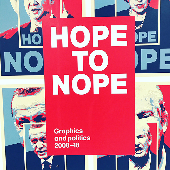
Hope to Nope at the Design Museum is stunning. It explores the intersections between design, technology, politics and protest over the last 10 years, and traces how graphic design and technology have become such powerful forms of protest.

The range of materials, formats and subject matter is vast – with work from established designers such as Shepherd Fairey to grass roots messages and campaigns about Grenfell, the events in Catalonia and feminism in China.
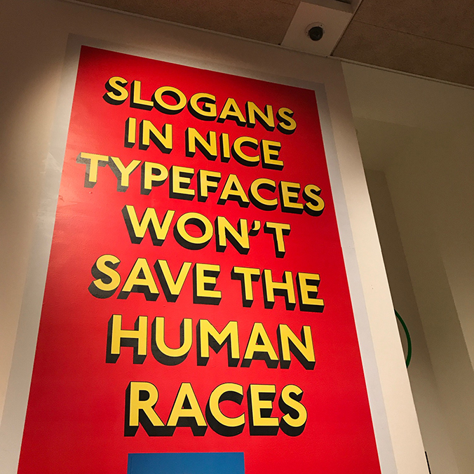
There’s a quote in a recent review in The Guardian that I thought particularly apt: “As you drift through the space, one of the overriding themes is quite how powerless the traditional tools of professionalised design and marketing now appear to be in contrast to the DIY alternatives, whether they be pasted on the wall or shared on Facebook.”
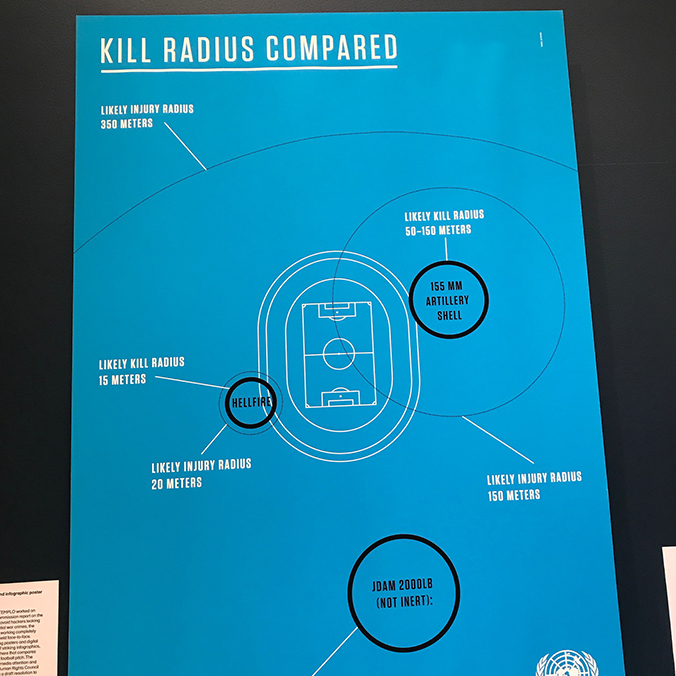
Go see it. Seriously. Hope to Nope: Graphics and Politics is on until 12 August.
And if you fancy making an afternoon of it, pick up the Azzedine Alaïa: The Couturier show on the ground floor. The Museum has a joint ticket price and it’s well worth seeing while you are there.

Design

Sunday Morning Farringdon Road

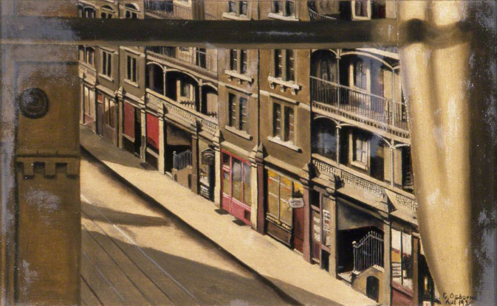
I’ve worked in and around Farringdon on and off since 1999, and I’ve long loved a painting by East London Artist Cecil Osborne. I’ve spent an unfeasibly long time trying to work out where the view it depicts through this open window, on a road I now know so well, is.

I find that it’s very easy to get lost in this picture. I’m drawn in by the warm, restricted palette of browns and reds, the absence of people and the stories behind the doors of the shops and dwellings. An early morning in 1929.

Cecil Osborne was a self-taught artist who was part of a fascinating 1920’s art collective called The East London Group, which featured working class male and female artists of the east end. Born out of an art club in Bethnal Green, the artists mostly came from all walks of local life and captured street scenes of the local areas. They exhibited and enjoyed popularity in the 1930’s, but post-war that popularity waned until an exhibition in 2014 brought them some overdue recognition:

“The Group painted the East End’s streets, alleys, mills, factories, pubs and churches with the same fascination that other artists have for the English countryside. The streets, in their paintings, look interesting, like places you want to see…and this without prettifying the essential industrial, poor reality. This is the real accomplishment. Somehow the character of the area, the vibrancy of its community, is communicated through these representations of its buildings.

Partly this is achieved by the flat colour and the way they all seem to have of capturing light. It suggests, to me at least, a parallel with that other great painter of the built environment, the American artist Edward Hopper.”

– John Rees

Osborne’s painting pre-dates Edward Hopper’s by a year, and it is the only one of his available in a public collection, owned by the Brighton and Hove Museum.

It’s said that the East London Group’s artists were able to see beauty in the most unlikely subjects, bringing ‘a warm feeling to their art which is transmitted to the viewer’. There are many parralels to me with the modern street photographers, who still find the east end such fertile creative ground.

As well as painting, members of the East London Group also made a documentary film, advertising posters for Shell and Phyllis Bray painted large murals which are now at Queen Mary, University of London.

I’m very excited to learn, through researching for this blog, that ‘Sunday Morning Farringdon Road’ lives not too far from me in Brighton and I’m definitely going to take a trip to visit it in person, if it is on display.

There’s lots of fascinating material about the East London Group:

The East London Group and their Contemporaries

The famed painters who vanished into obscurity

Cecil Osborne’s Lost Murals Rediscovered

I’m definitely keen to find out more about these artists. But this morning, I’ll just keep losing myself in Osborne’s best-known work.


Design

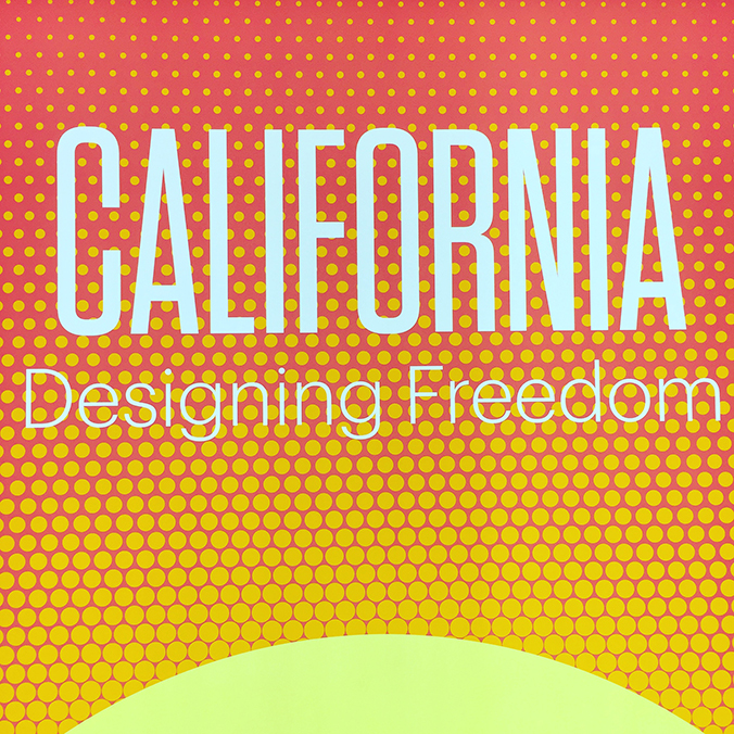
California: Designing freedom

California is one of my favourite places on the planet and when I saw this exhibition advertised, I was very keen to go and to understand more about how it came to have such a powerful influence on contemporary design. Not only that, I’d not yet been to the new Design Museum in Kensington, so it was being able to combine both, along with it being my Mother-in-Law’s Birthday that provided the perfect prompting for a day out.

The exhibition explores the ideas around how 60’s counterculture of surfers, feminists, gay and black activists and hippies all influenced the California design movement that has developed into Silicon Valley tech culture. It makes a bold point about how this has had such an effect on all of our lives that it means that we are now all, in some ways, now Californians.

The artefacts on show – which open with a shining sun and include films, magazine covers, posters, hardware, physical items, virtual reality, skateboards and acid tabs are grouped in 5 ‘zones’, all underpinned by the ‘freedom’ theme:

  • Go where you want
  • See what you want
  • Say what you want
  • Make what you want
  • Join what you want

The exhibition doesn’t cover the usual territory that predecessors have – mid-century modernism; rather picking up in the ’60’s and coming right through to the present – and the near/now future, including the self-driving car. It’s packed with brilliant things to look at, read and imerse in. To be honest, the original concept paintings from Blade Runner are a highlight, and pretty much worth going to the show just for those.

I loved, loved, loved this exhibition.

We also took the opportunity to have a mooch round the Design Museum – which, actually was a bit unimpressive. There’s some lovely things, but it all seems very crammed in. They’ve given so much space over to the atrium/centre of the building, that it feels like the exhibits are secondary, which is a real shame. However, I loved seeing these typographical design systems for Britain’s roads, and the beautiful Kohnioor font from the Indian Type Foundry.

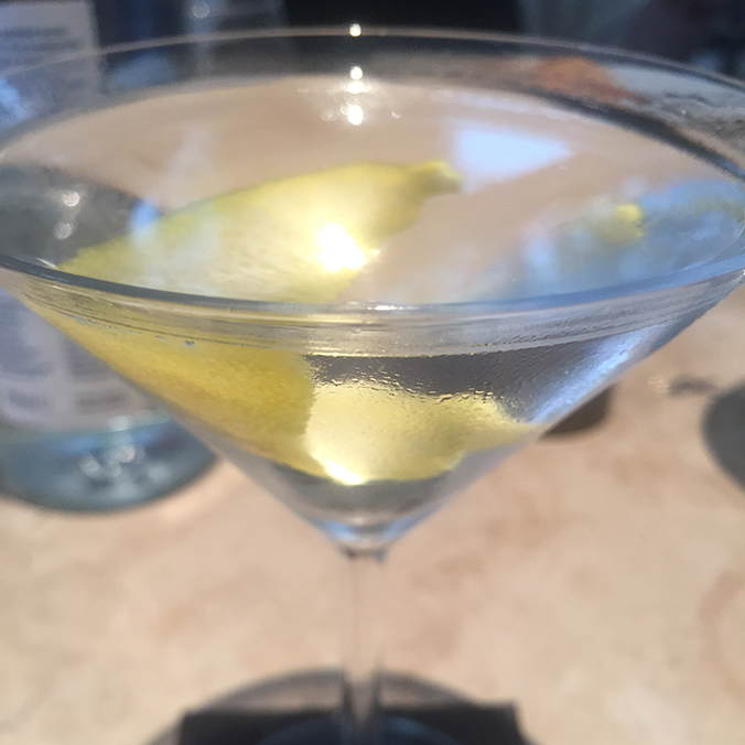
We lunched after at The Bluebird cafe in Chelsea. There were martini’s, obvs.

The ‘California: Designing Freedom’ show at the Design Museum runs until 15 October 2017, so there’s still time to take in the California vibe. To purchase tickets, visit the Design Museum’s website.

Save