Browsing Category

Design

Design

Right arm tattoo

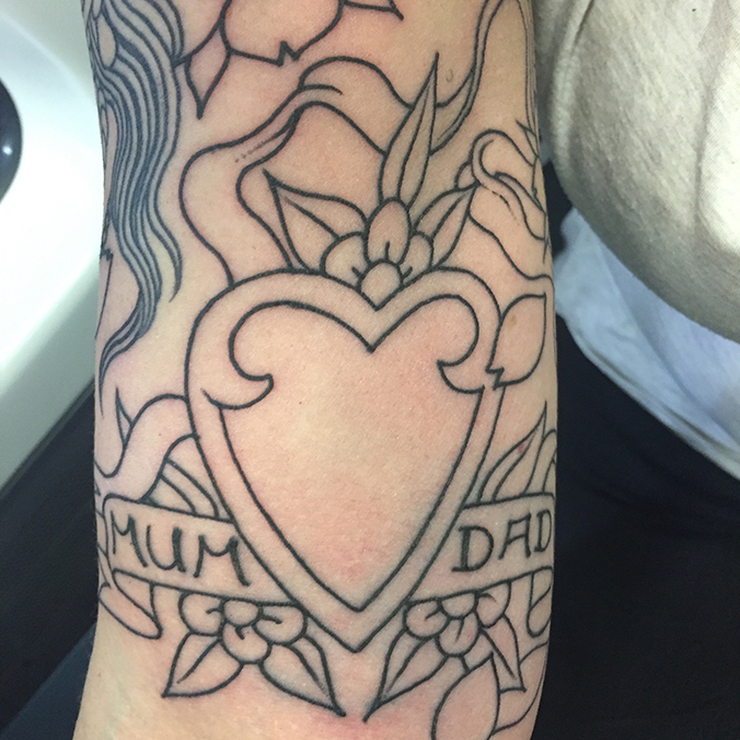
Continued the final piece of the tattoo I’ve been working on for 3 years. This is part of the top of my right arm, and only shows a small part of the rest of the whole outline we did in one session at Modern Classic. I’m sure there will be some more line work to do, once we see how it’s looking – blossom’s and flowers probably.

The piece consists of a beautiful girl head, an hour glass and this heart with a scroll, which is pretty much a direct copy of a tattoo my Dad had when he was 16. I can’t wait to see it all coloured, it’s going to look outrageously good. The only question is, do I conintue with my forearms, but for now there’s a bit of a wait until the next session.

img_7634

Save

Save

Design

Roman type

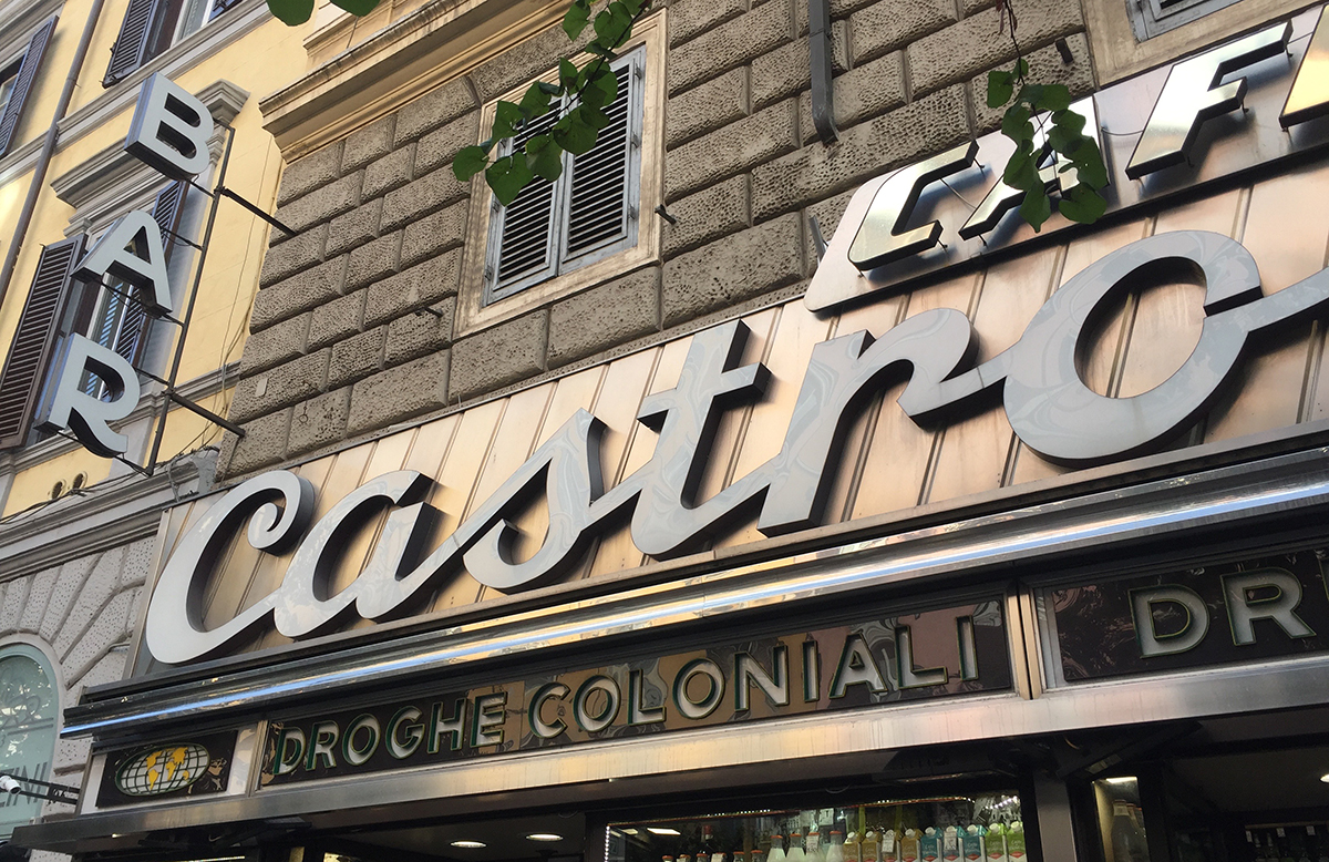
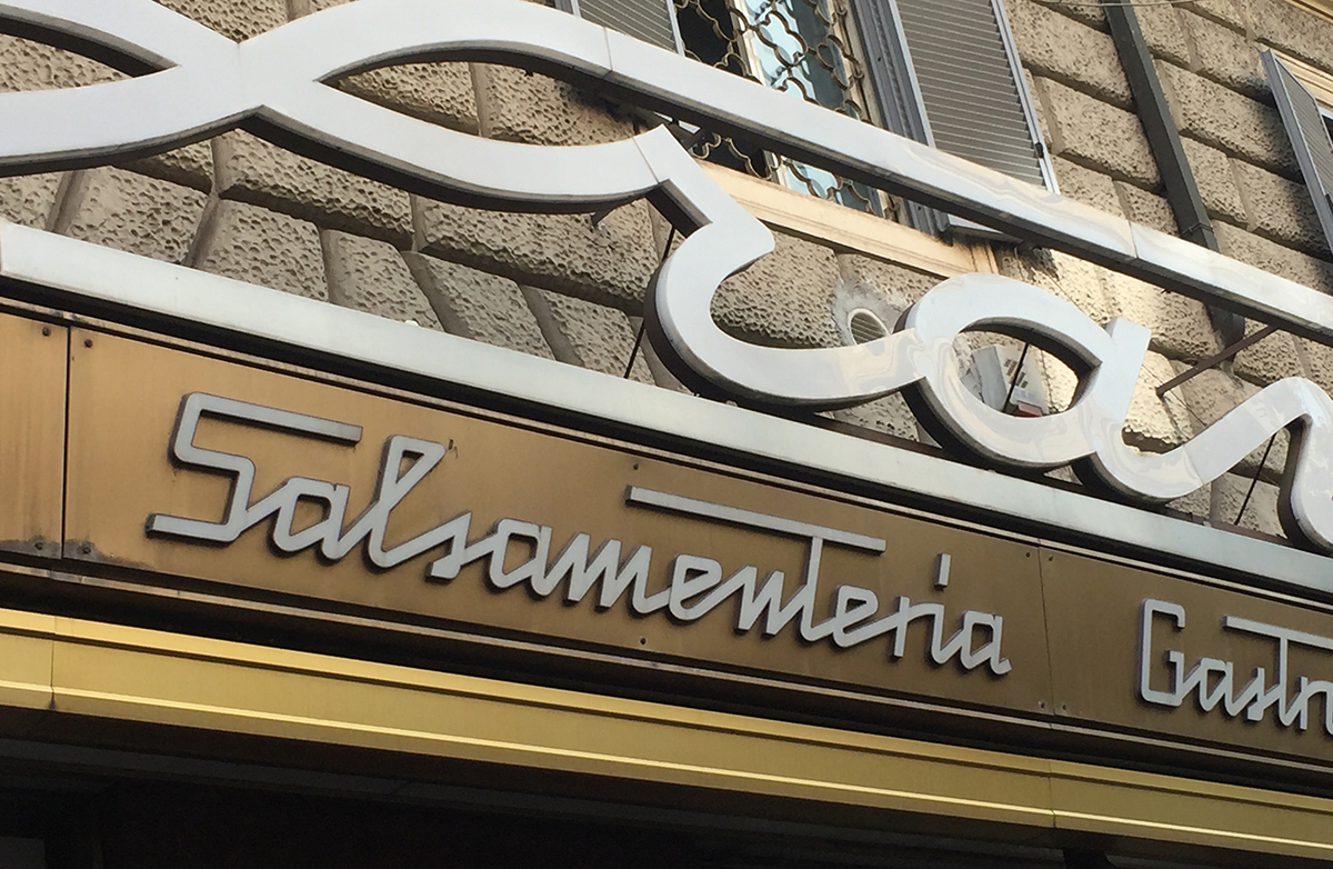
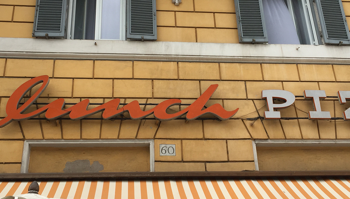
Love these typefaces I spotted on our recent trip to Rome. There is something stunning to see every time you turn a corner in Rome, and the typography on some of the shop fronts is no exception. It’s not all old buildings 🙂

img_7593

img_7596img_7599

Save

Save

Design

Gorgeous pencils

I’m such a lover of stationery, these pencils from letterpress and stationery designers Marby & Elm always catch my eye as I walk past the window. I love the colours – neon brights are always a winner!

img_7703

Save

Save

Save

Save

Save

Save

Design

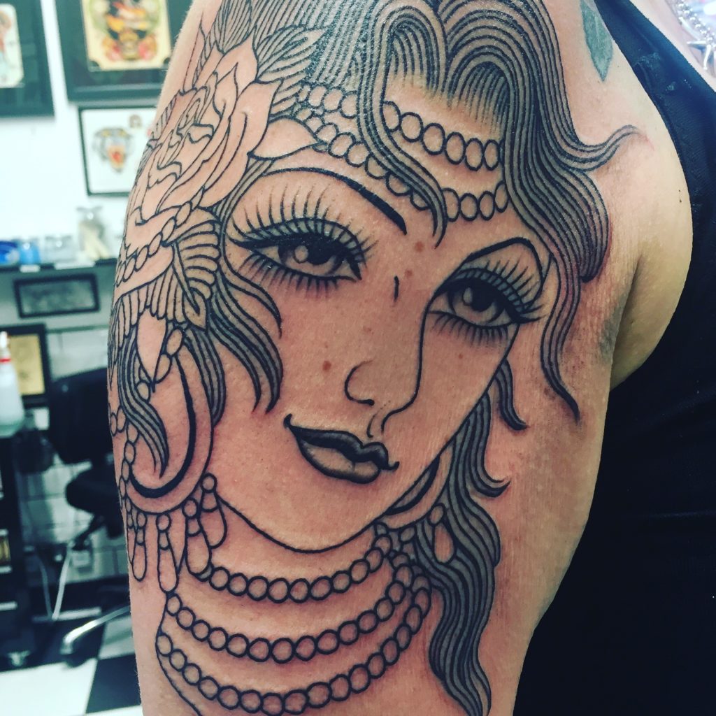
Tattoo – phase 3

I’ve started the last ‘phase’ of my back/arm piece. The design for the right arm is going to include a gorgeous girl-head, along with a modern take on my Dad’s old heart tattoo and an hour glass. Joined together with flowers and ribbons. At least that’s what it is planned to be – the designs always change and morph as we go along, which is one of the great things about not starting out with a fixed plan.

Just look at those eyelashes…

img_7384


Save

Save

Save

Save

Design

Reflection

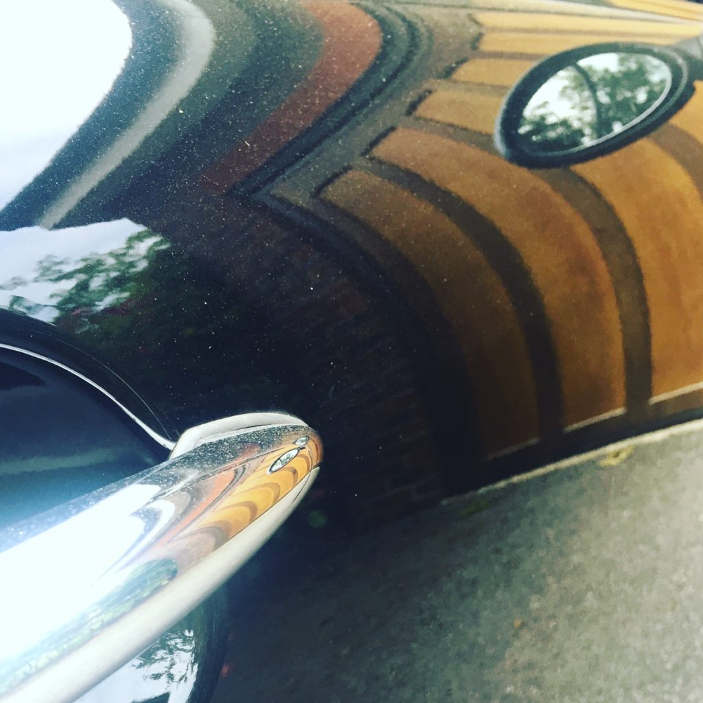
Crazy ‘Hall of Mirrors’ effect of the reflection of the garage in the car door.  I like the fact it’s dusty too and a bit warped. Was just playing around with images.

IMG_7178

Save

Save

Save

Save

Save

Save

Save

Design

Vogue 100

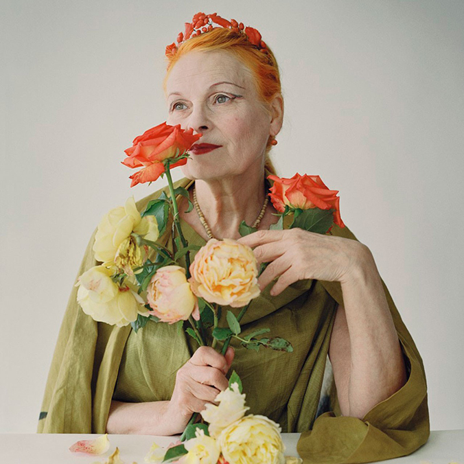
Hot on the heels of last week’s visit to the V&A, this week I took myself off to the National Portrait Gallery to see the Vogue 100 exhibition.

The show celebrates a hundred years of Vogue, through the photography and portraiture of the magazine. When you enter the gallery at first it seems strange that the collection starts at 2016, with the familiar faces and fashions of now, but as you move through the rooms and down the long gallery you realise that it’s perfect to be going ‘back’ in time, overwriting the familiar, and finally ending with wonderful evocative images from 1916 and the twenties.
Viv

I’ve never bought a copy of Vogue, so if you’ve never actually read the magazine it doesn’t matter. This show is all about the amazing imagery, and often also the subject matter. The wall size shot of Alexander McQueen as you go in hits you right between the eyes and that is followed by shot after mesmerising shot.
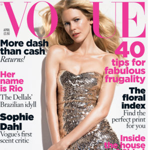
Vogue 3Vogue 1Vogue 2

There were two things that in particular I loved. The first was the planning room, a small area that shows a series of slides from different shoots and then finishes with shots of the front cover or spread that the final images appeared in. The transparencies where also available to view on light boxes in the room – I wished I had a loupe to be able to really study them close up. They were captivating.

The second favourite area was a room that had a timeline on the wall and representative front covers from each decade. The changing styles of layout and type over the decades was clear to see and seeing the shots that you’ve seen in the exhibition then placed in the graphic design format of the covers, with the masthead and type, was great.
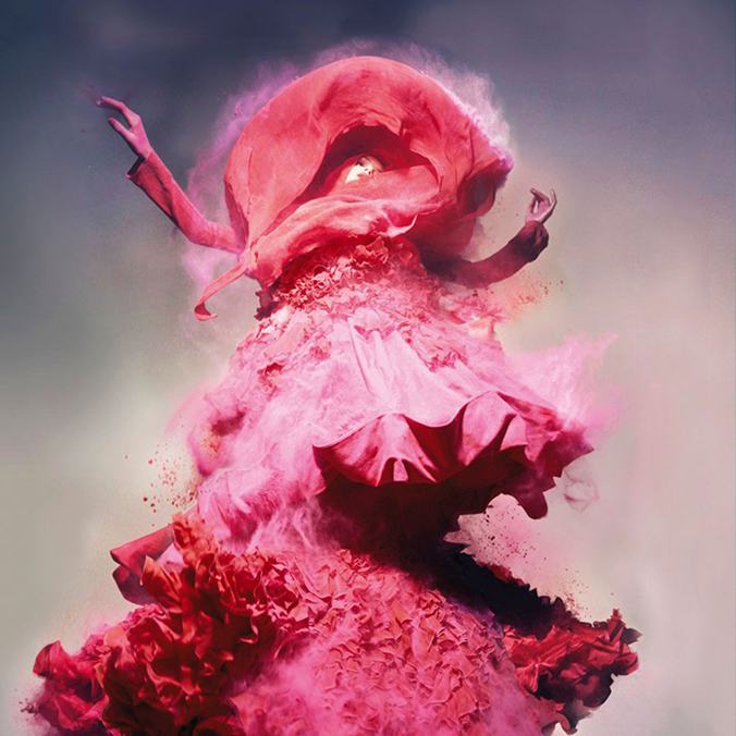
NPG_pink

Obviously, the imagery speaks for itself and there’s a mesmerising piece of motion art on 2 huge walls – videos from shoots and other footage, which I could have stood and watched for ages. The show is beautifully curated and it’s a large body of work. We went in the evening and it was a perfect antidote to a busy Thursday.
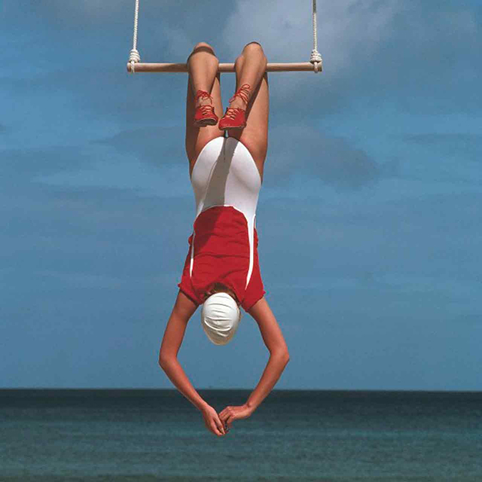
swim

Again, there was no photography allowed in the show so I’ve used some here from the Vogue website. On the way out I bought the accompanying book, which is wonderful. Rich and luxurious and something to pore over – which I shall be doing a lot of this weekend!

Save
Design

Undressed at the V&A

Undressed-banner-final

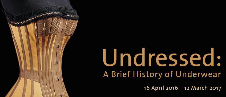
Undressed, at the V&A is a show dedicated entirely to underwear, and I had a lovely time seeing it yesterday.

Corset

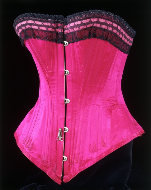
With 140 men and women’s pieces from around 1750 right up to the present day, the collection features not only the history of undergarments but also the role of underwear in fashion. There were some amazing exhibits, in particular a gold crochet dress from the 1930’s and an Alexander McQueen gown. The detailing on both was stunning, as was the design and construction of some of the corsets. There is one piece in the show which had been made for Dita Von Teese, which was lovely but also quite shocking – I think the waist size was probably smaller than the size of my thigh. It was teeny tiny, which I know is kind of the point with a corset, but I couldn’t actually imagine how anyone could have a waist that small!

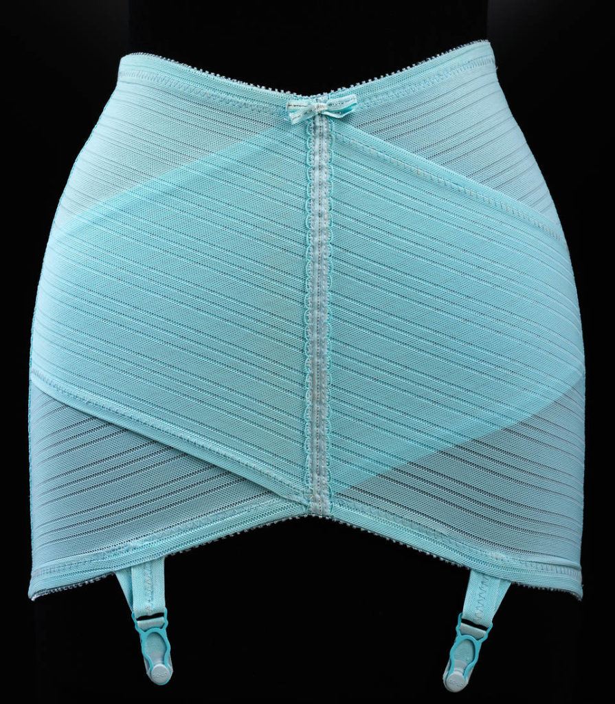
I loved some of the 1930’s – 1950’s pieces, sexy champagne coloured girdles and this blue one, that looks modern today.

undressed-hero

It’s not a large exhibition, so you can easily get round it all in a hour, and then do what we did and disappear off for a lovely lunch in the sun after!

Unfortunately the V&A are not allowing visitors to take any photographs of the show so I wasn’t able to take any shots. The ones used here all come from the V&A site.

Save

Design

Taking Care of Business

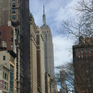
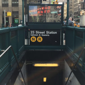
Friday in Manhattan was just as gorgeous, weather-wise, so we once again set off on foot, scoring a fantastic turkey sandwich from a deli on the way. We headed down towards the Flatiron district, through Bryant Park and sat outside a café by the Flatiron in the sun. We then carried on walking, all the way down to the lower east side, stopping to share fish and chips at a really nice place called Bar Fish.

IMG_6510IMG_6512

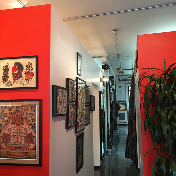
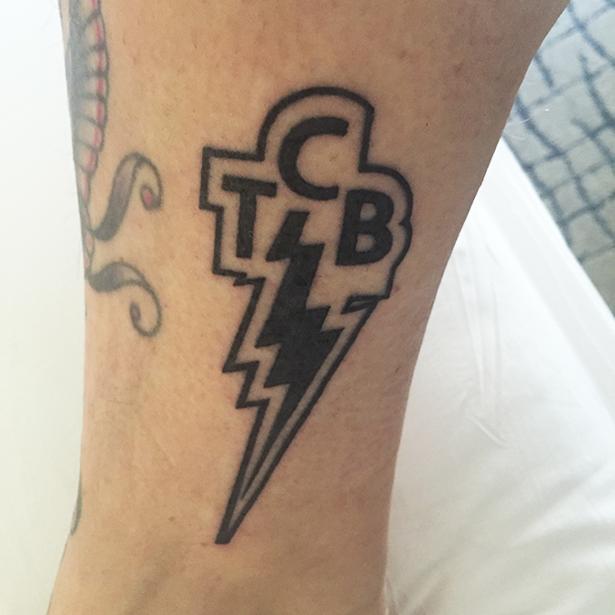
Once we were near New York Adorned we nipped into a Cuban bar for a couple of fortifying vodka shots. I’m not used to being tattooed without heavy-duty painkillers but I didn’t have any – luckily the spot we’d chosen on the ankle turned out to not be painful at all.

IMG_6483We had chosen a classic TCB design, with the lightening bolt and a thick outline. Madge had taken it from a picture of a replica Elvis Presley pistol, cleaning it up a bit in Photoshop and removing the trademark! It was a simple stencil but really, really relied on the artist having a steady hand, as the lines are dead straight.

Madge went first, while I sat and watched. It took longer than I expected, but it was soon my turn to hop up on the bed. The tattoo didn’t hurt at all – a tiny pinch near the ankle but apart from that, plain sailing. It’s very, very different to everything else I have – which is why I really like it. It’s got hard edges and it’s very graphic, in a way it kind of jars – everything else is organic and natural and fading, so it stands out. I’m really pleased with it.

IMG_6545

Save

Design

Getting geeky about type

This week I had the very great pleasure of listening to a talk about my favourite design discipline – type.

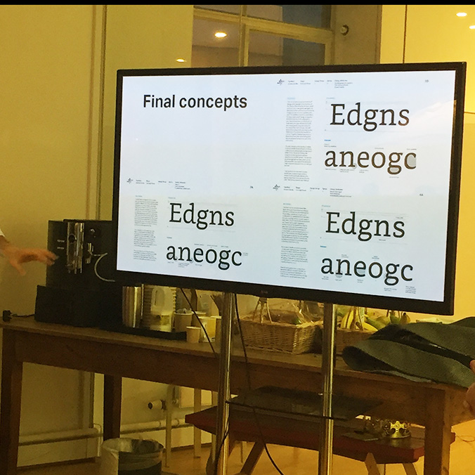
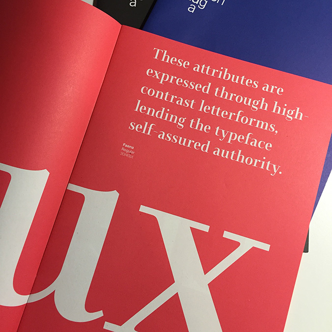
Legends Bruno Maag and Vincent Connare came into Friday to talk to us about why type matters, how they create new typefaces, the impact of their font for Kindle and how Comic Sans was created.

IMG_6246

I was in my element, listening to these guys talk to us about the process and craft of creating type and I’ve rarely seen Madge so animated or fired up about a lecture subject matter. I could have listened to these guys talk all night, and they even left some lovely takeaways for us. My Dalton Maag notepad is so nice I probably won’t ever actually use it.

IMG_6247

IMG_6264IMG_6266

Big thanks to Jo Simmons and Alex Mecklenburg for organising this.

Save